Client: PROFACTS [profacts.ca]
Role: Designer & Developer, start to finish
Built With: Custom HTML & CSS
Skills: Web design, custom HTML and CSS, information architecture, navigation design
PROFACTS is a workplace safety training and consulting company operating throughout Ontario — North Bay, Barrie, Timmins, Sudbury, and beyond. Genuinely great clients to work with, and the kind of project where the hard part wasn't the design, it was the sheer amount of stuff the site needed to hold.
The Challenge
PROFACTS offers more than 25 individual training programs — everything from Working at Heights and Confined Space to Defensive Driving, WHMIS 2015, and Mobile Crane Operator — plus a separate set of consulting services like Facility Audits, Risk Assessment, and Compliance Reporting. Every one of those needed its own page, and every one of those needed to be findable.
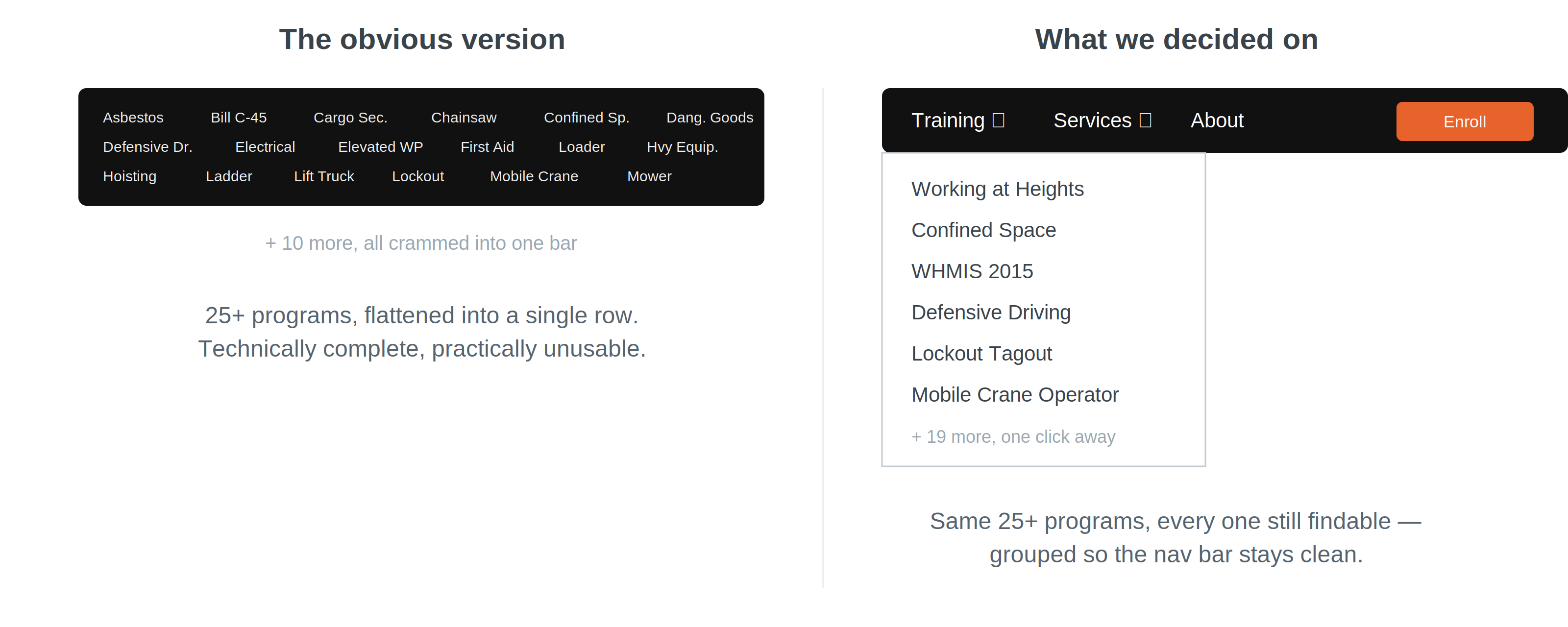
The obvious version of this site is a navigation bar so packed it becomes unusable — a wall of 25+ links nobody wants to scroll through. But trimming the list wasn't really an option either: every training program listed is one a real business might specifically need to search for by name.
How I Solved It
This was a genuine back-and-forth, not a "here's your site" handoff. We worked through how to group the trainings and services in a way that still let every single program keep its own page and its own visibility, without turning the main navigation into a wall of text. The compromise was a structured, categorized navigation — Training and Services each live under their own dropdown, with every individual program listed underneath, so a visitor looking for something specific (say, "Scaffold Construction" or "Lockout Tagout") can find it in a click or two, while the top-level nav still reads cleanly.
It's a good example of what "compromise" actually looks like on a client project — not cutting content the client needed, but finding the structure that could hold all of it without collapsing under its own weight. Worth noting: this was hand-coded in HTML and CSS rather than built on a CMS or page builder, so that dropdown structure had to be built from scratch rather than dragged in from a template.
The Impact
A live site that's still doing its job today: 30+ courses, over 1,750 certificates granted, and more than 25 years of business history, all organized under a navigation system that doesn't buckle under the weight of the catalog. It's also proof that "simple" and "comprehensive" aren't opposites — they just take the right structure to coexist.
Curious about the design decisions or the WordPress setup specifically? Happy to dig into either!